Two years as Brand Design Manager for a Microsoft IT recruitment firm, starting from a generic logo, with no website or digital presence. I built the identity, the website and the ongoing marketing.
The company
SPG Search is a Microsoft IT recruitment specialist, connecting organisations with senior SharePoint, Microsoft 365 and Azure talent across the UK and beyond.
The challenge
A generic logo — a globe of people with the line “Making the search simple” — and no visual system or digital presence behind it. The scope was a new identity, website and an ongoing marketing strategy to position SPG Search as the Microsoft recruitment partner.
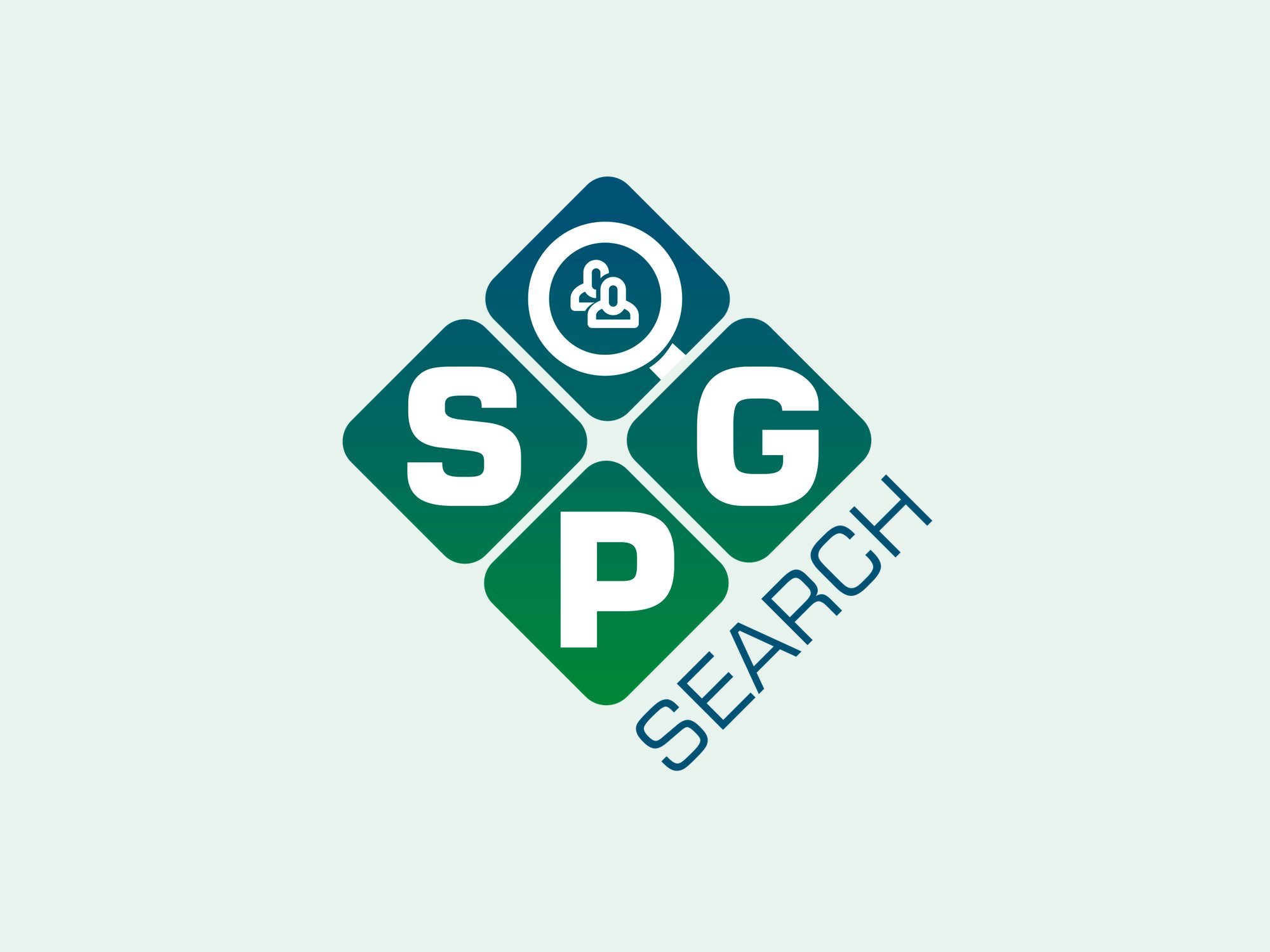
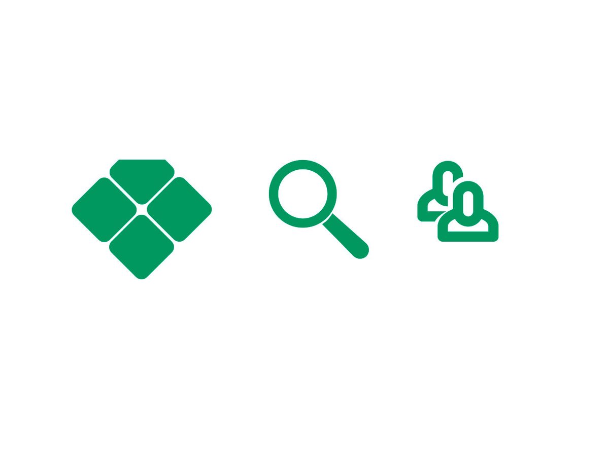
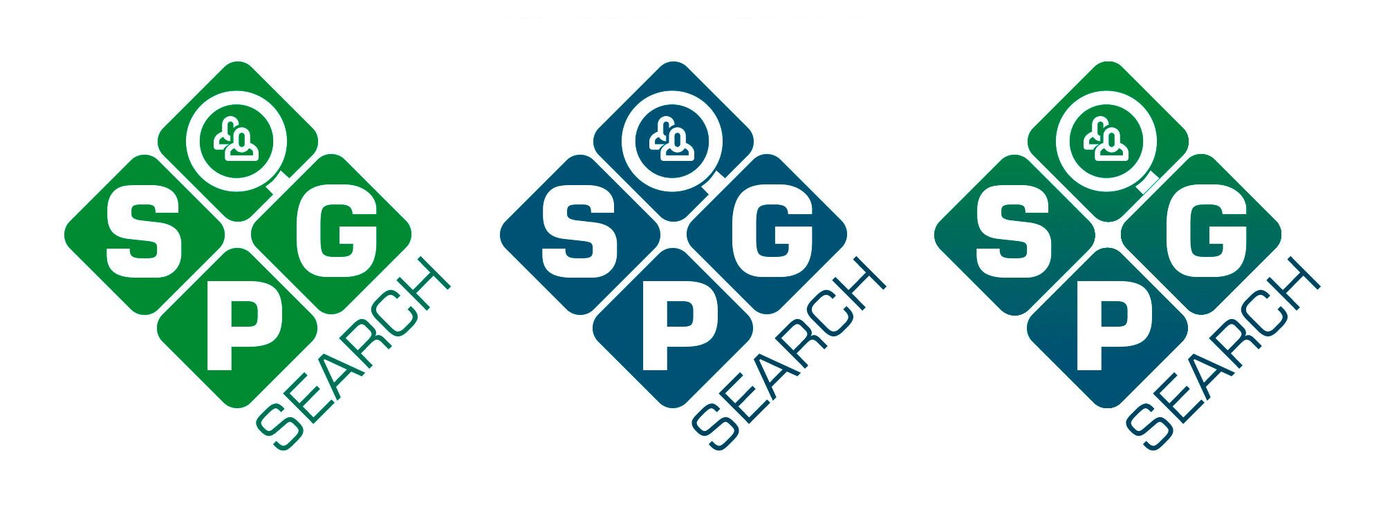
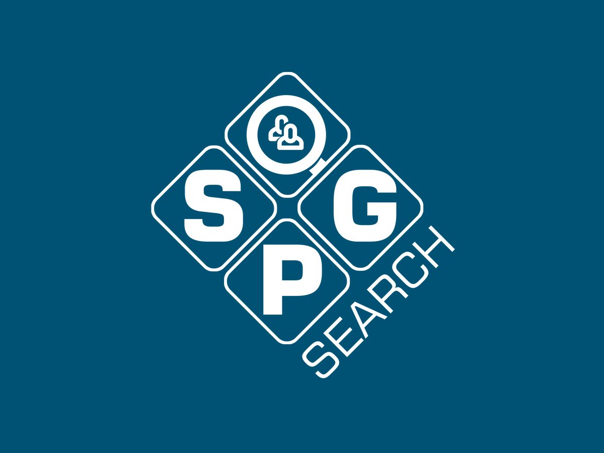
Four rounded squares form a diamond, like the cells of a honeycomb, holding the S, P and G. The magnifying glass and the candidate icon sit on top: the search for people, built into the mark.
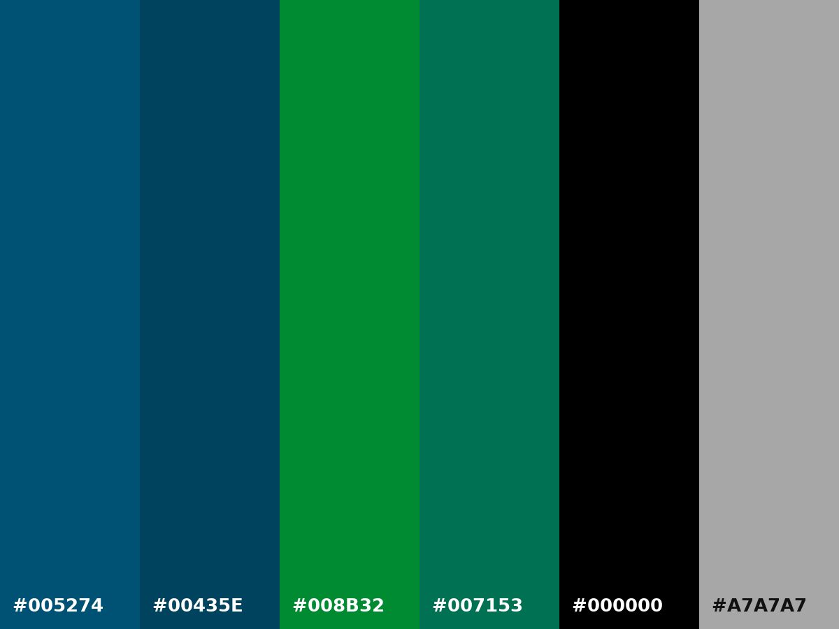
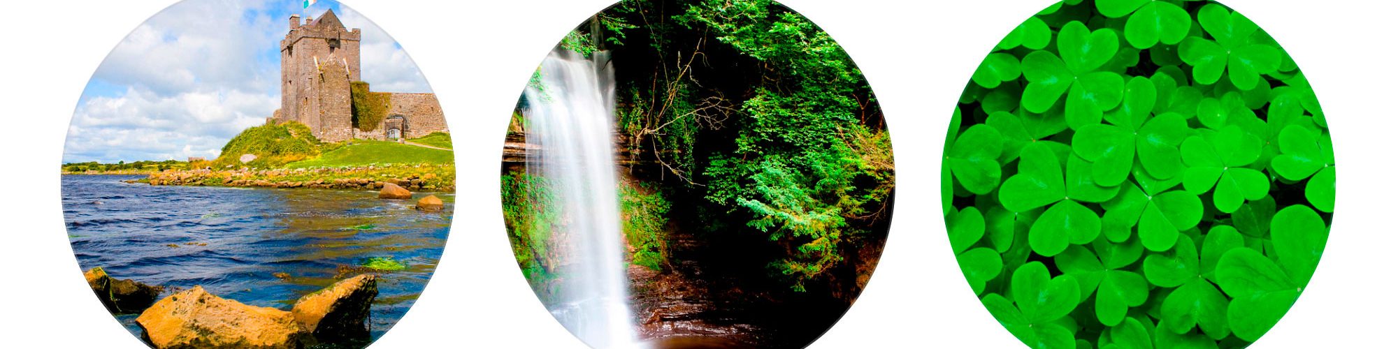
Blues and greens drawn from the landscapes of Ireland, home of the company's founder and CEO — sea, stone and clover — balanced with black and grey.
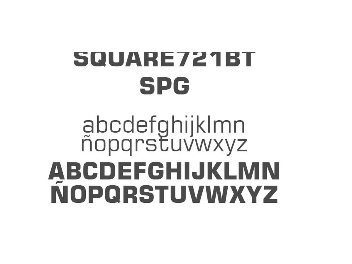
Square 721 BT: wide and solid, with a technical edge that suits a Microsoft-only recruiter.
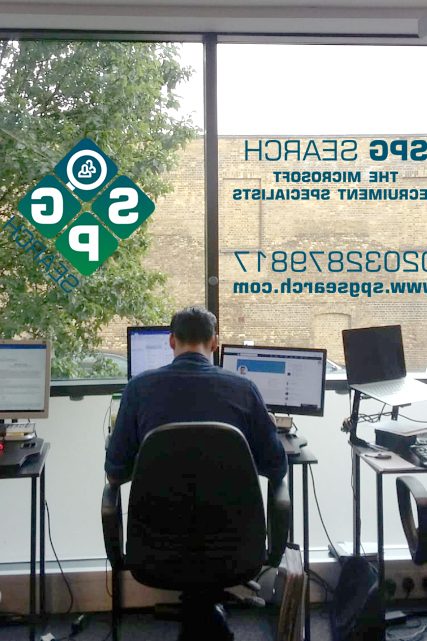
One logo, three colour variations — green, blue and a green-to-blue blend — plus reversed and greyscale versions for every context.
The full SPG Search identity from scratch: logomark, colour, typography, iconography and brand elements, with logo variants for every context.
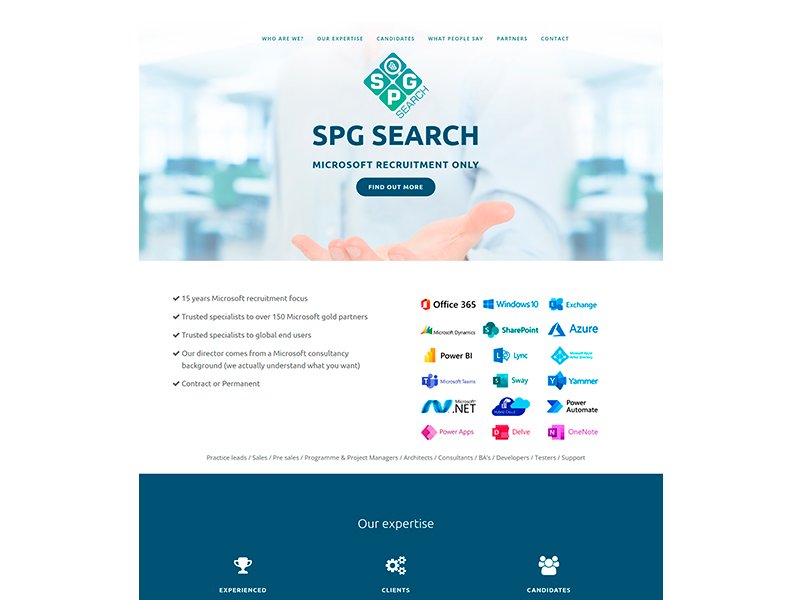
Design and front-end of the corporate website: on-brand, responsive and built to convert enquiries from clients and candidates.
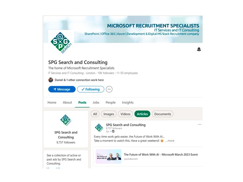
Full design of the company LinkedIn page: banner, profile visuals and ongoing posts to build recognition in the Microsoft IT community.
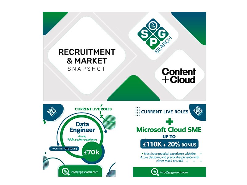
Online banners and campaign assets for lead generation, aimed at hiring companies and Microsoft IT professionals.
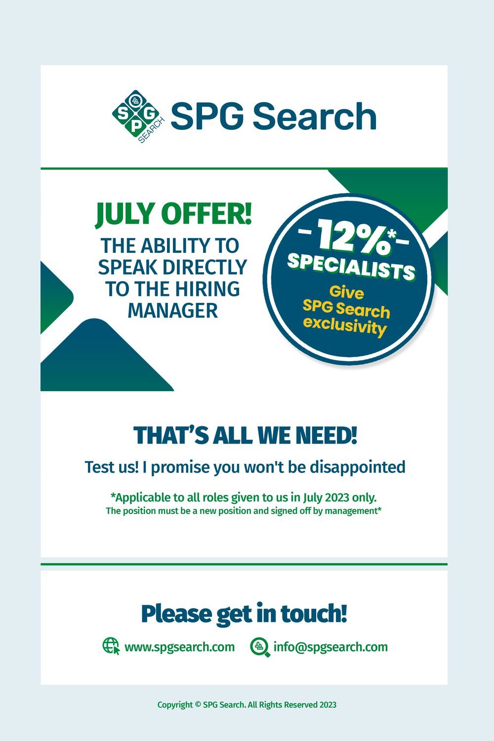
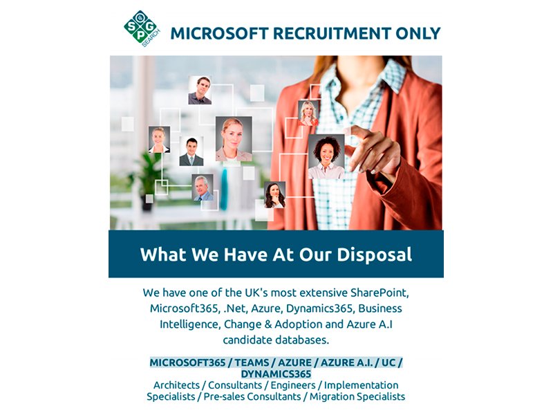
Presentations, newsletters, email templates and sales collateral, all to the same visual standard and voice.
The full identity documented: usage rules, colour specs, typography hierarchy and application examples.
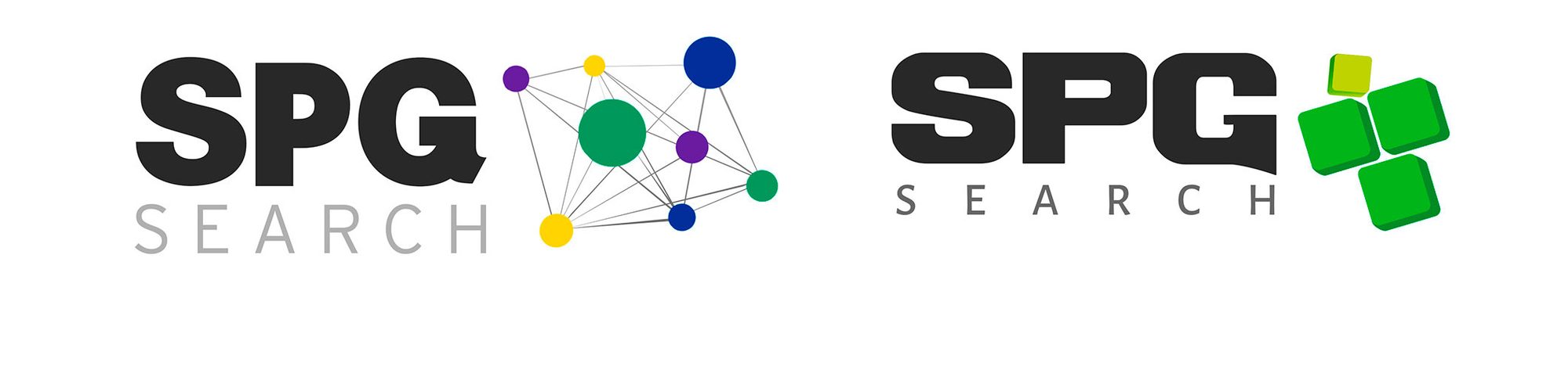
Both routes were dropped because neither fully captured the idea of connection and working together.
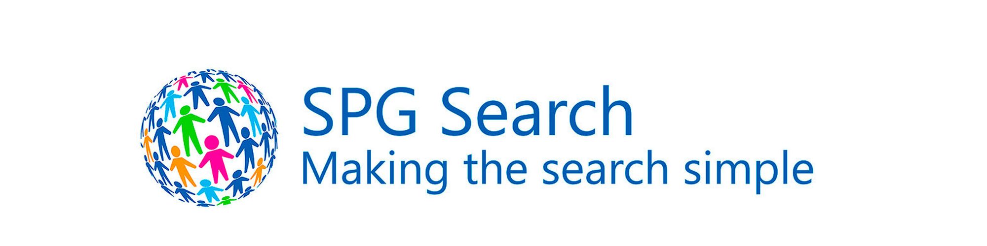
Before
A generic globe of people that could have belonged to any recruiter, with nothing to say about Microsoft.
After
The diamond system won: a nod to a honeycomb, where bees always work as a team. And for an IT recruiter, the magnifying glass searching for people reflects exactly what the brand sets out to do. Once the brand reached LinkedIn, the company page grew from 50 to 9,700 followers in under two years.
End-to-end brand ownership. From the first logo sketch to running every touchpoint. Over two years the SPG Search brand was built, launched and kept evolving with the company. SPG Search is no longer trading; the work is shown as a record of 2022–2024.