Two and a half years as Brand Design Manager for a Microsoft-first consultancy in the UK. I took on an existing brand, set up its LinkedIn presence and carried the identity across content, campaigns, sales material and merchandise, so it matched the quality of the engineering: sharp, credible, senior.
The company
The A Teams is a Microsoft-first consultancy across Azure, M365, Power Platform, Dynamics 365 and Data & AI, placing senior engineers and MVPs into enterprise transformations.
The challenge
The brand already existed — a red power button on black — but it had no LinkedIn presence and nothing that carried it into conversations with clients. My brief: create the company page and apply the identity consistently to everything the business put out.
A power button with an upward arrow: switching on, moving forward. Red on black, with nothing in between.
The company is run by its two founders, who deal directly with the CEOs of large organisations — not with their teams. Every piece had to speak at board level: direct, sober, no noise.
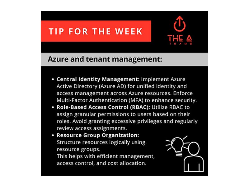
Content series such as Tip for the Week gave LinkedIn a steady rhythm and a recognisable look, post after post.
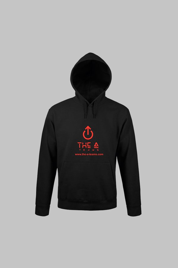
Roll-ups, clothing and objects took the same red-on-black mark to events and meetings, where the founders meet their clients.
Primary channel: LinkedIn. Everything was designed for B2B decision-makers there, from organic thought-leadership to paid campaigns aimed at enterprise buyers in the Microsoft ecosystem.
Design ownership of every brand-facing material, so every touchpoint held the same standard and voice.
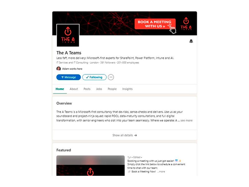
Creation of the company LinkedIn page — the brand's only active channel: banner, avatar system, featured content and consistency across every organic post.
Recurring branded formats, including the weekly Tip for the Week series, built to grow authority with the Microsoft community.
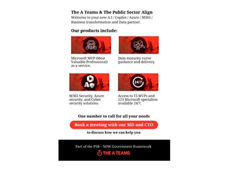
Paid and organic campaign visuals for LinkedIn: banners, CTAs and ad formats aimed at enterprise decision-makers.
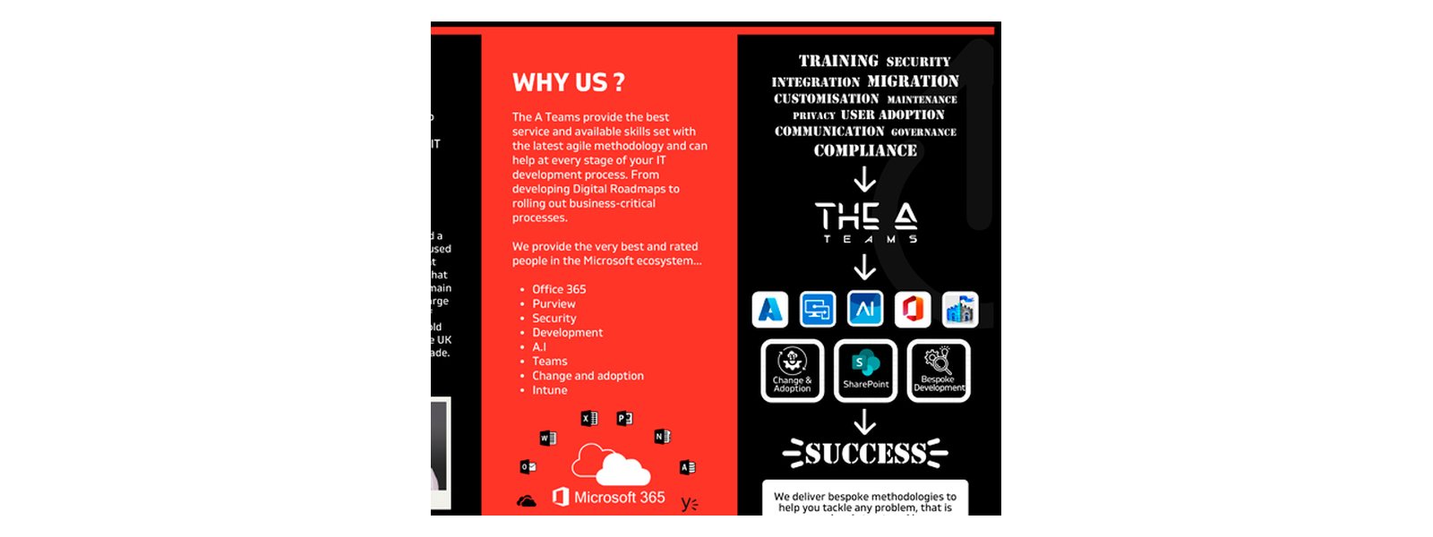
Brochures, one-pagers and pitch support, including the trifold Chaos Calmer brochure used in enterprise sales.
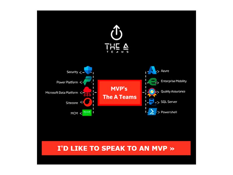
Infographic and visual design for the MVP network, mapping the Microsoft stack the consultancy covers.
Hoodies, T-shirts, caps, bottles, bags, mouse mats and roll-ups: the red-on-black mark taken off the screen and into the room.